Working the Color Wheel
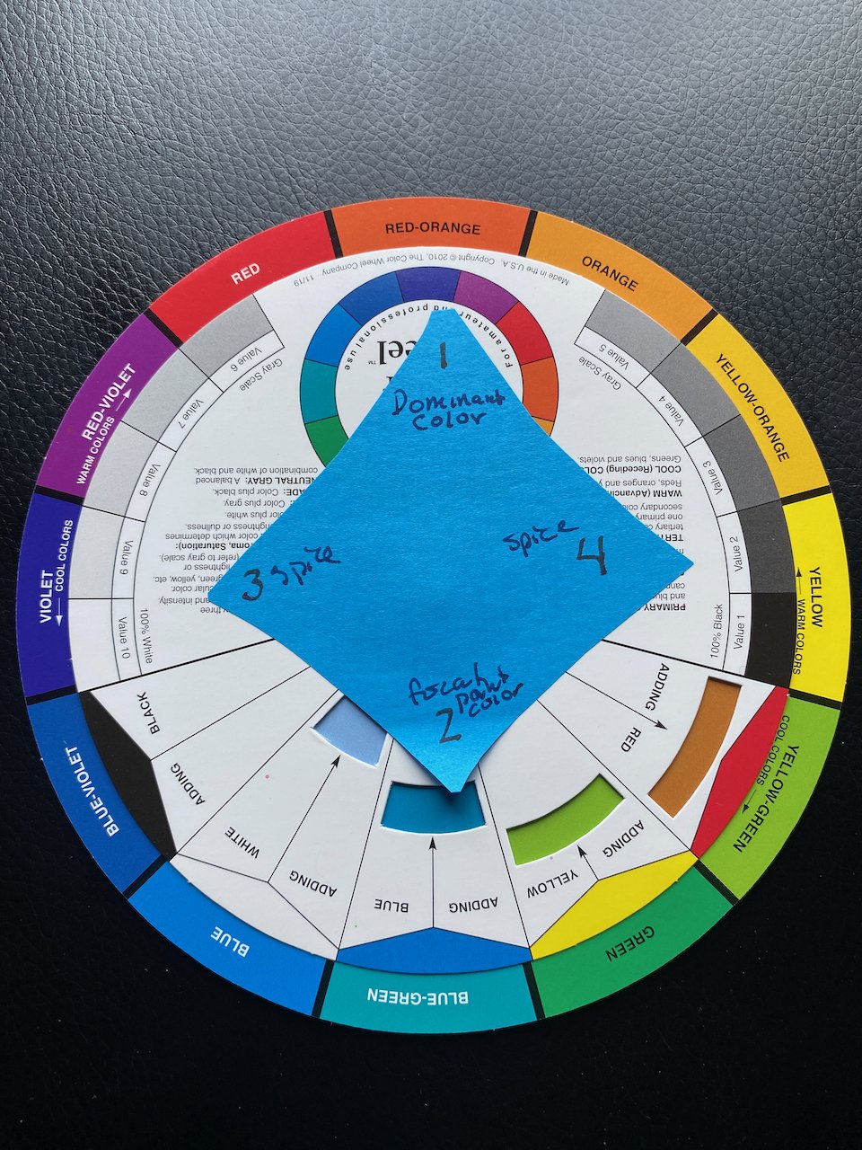
My modified color wheel, based on Bob Burridge’s version.
Or how to gain control of the desire for lots of intense color!
Maria Victoria Chea has a color combo that I love. True, most of her work is in oils but that doesn’t negate the value of the paint and color combo. It is super easy to go crazy with all your tubes of paint and want to put them all on the paper. We all have done it. The end result is not what you had hoped for. It turns into a mess, a cacophony of color.
Try backing off a bit and choose four colors. One primary and then the color opposite it on the color wheel. Your primary color is at 12o’clock, the primary focal point color at 6 o’clock. At 9 and 3 are your spice colors. Use these sparingly to enhance your focal point of the painting. For more on this, see Bob Burridge’s video.
White and black or a neutral are not part of the four but are important players. White added to your colors will make them go pastel. Black or a neutral tint will darken the colors. As Bob Burridge shows, you can make fairly neutral backgrounds with your two main colors, black and white. By keeping to a limited pallet your art work will hold together and resonate. This works with all paints, color pencils, pastel, and I am sure many other mediums I have not mentioned.
Once you start seeing the color wheel this way and examine other artists work that speaks to you, the rule of four (for the most part) will be at play. Spend sometime looking at art that you like, even Tim Holtz’s work follows this most of the time.
This rule of four colors can be applied to anything with color, a card, gel plate, collage, quilt, etc. I made a diamond out of a Post-it note to help me identify the colors. Give it a try and see if it changes your work. Or perhaps takes the overwhelm out of crafting by limiting the colors.
