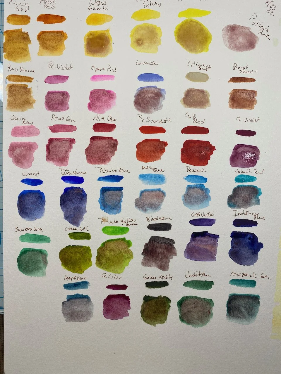
Potter’s Pink
Color swatches using Potter’s Pink with my other colors. Interesting how it blends.
I love learning from other artist’s what materials they like to use. In this case I happened onto Potter’s Pink. This is not like Opera or Neon Pink that is bright and in your face. Opera Pink has a place on my pallet as it adds a nice hint of eye catching color when it is needed.
Potter’s Pink is a granulating watercolor pigment, it dries in clumps. I love this look as it adds a layer to the painting. Thin in color, its power lies in mixing. See the photo for my sample swatches. This funky earthy pink color is blah with yellows. It makes the oranges a bit more earthy colored. Reds become muted. Mixed with blues and greens though and do you get some interesting color combos. Purple tone to grays that lean on the added blue or green.
Potter’s Pink is a color I wish I had known about when I lived in Santa Fe, it would be perfect to create adobe colors. I look forward to using it in my paintings here on out.
